Showing posts with label exercise. Show all posts

Sunday, 11 October 2015

Making Tyvek Lace

I saw this short video on making lace with Tyvek and had to immediately try it.

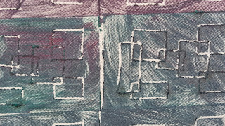
Results not too shabby:


Not terribly successful but you learn from mistakes


Shown under the baking parchment

Shown still stuck to the stamps, cooling

I used the printing blocks/stamps I'd made in my August post on visual exercises.

A few learnings:

  • set the iron between wool and cotton
  • use rubber stamps (try one out beforehand) - I used this Super Soft Lino Block
  • use baking parchment above and below
  • be fast and press hard
  • let the stamps cool after a few uses before carrying on

I love the randomness of the results even when you get the technique under control.

Really exited about the possibilities.


Saturday, 1 August 2015

Another Visual Exercise


The goal is to "explore the possibilities of stamping as a design tool."

Simply cut one lino block a day for 30 days. Or, if you can't wait, cut six in one go for five days. Then print, print, print.

They suggest using rubber erasers. I bought some 'soft lino' which is essentially a rather slim piece of rubber which is indeed very easy to cut into. A pleasure compared to real lino although the deeper you go and the nearer the sides the less sharp is the edge of the cut. Or perhaps that's just my tools.

Here's how it went for me:

Penciling in a pattern

The pattern cut - you can see how the edges 'fray' in this lino; this was happening when I was going over a previous cut with a deeper one - this lino doesn't like it

Cutting the lino

I had some plain acrylic paints and rollers from way back and decided to try out some samples.

Inking up a perspex plate

First impressions

The inking plate after an impression

First results - the orange block here has a full border and a lot of positive

Immediately soaking the blocks - acrylics dry really quickly

The next colour and some other tools to make impressions

Second sample

I also tried some out on fabric in my class.

Hodge podge of prints (this includes impressions from some screens as well as the blocks)

One block in a small range of colours

Detail - I love the painterly effect of brushing on the colour instead of impressing it


I veered noticeably towards the blocks that had less positive carved into them. This made me realise how many of the blocks I'd made with too little negative and full sharp borders making them heavy and 'blocky'. The full borders are much harder to line up than blocks that don't have borders.

So I started to reverse some of the blocks I'd made.

Two versions of the same pattern - positive and negative

And made some blocks that were all borderless and mostly negative.


Some more samples:

The green block is printed out three times left to right before re-inking therefore getting fainter each time

I also made a traditional lino cut which I overlaid on my soft lino block (printing out four times top to bottom). I love the surface quality of the leaves (plus they look so 'tumbly')

So far I haven't quite cut 30 blocks. I started out well, with a couple of consecutive days of 6 each time but then fizzled a bit. I'm finding it hard to come up with motif ideas. Partly because I'm restraining myself instead of letting loose on the lino. One evening I decided to get really angry and do whatever even if it meant slashing the lino to bits. And even though there was no-one watching I just couldn't!

So this is where Slasher Frankie has got to:

22 blocks

If you fancy taking this to another level then how about designing and printing a half drop repeating pattern?


Saturday, 27 June 2015

Screen Printing

More progress from my class: my very first screen printing.

I'd always thought of this as a rather mystical, unobtainable technique that I would never experience. Only really expert artists made screen prints! And all those people who were doing Art while I had to do Latin at school.

This is what happened:

The prep work for the stencil and the cutouts from the stencil.

The stencil based on my bird theme.

My flight of birds across a piece of tie dye I'd made. I like this a lot.

Detail of the piece above showing the patterened texture of the fabric.


The flight across some patterned textile.

And again, trying to join more than one repeat of the stencil.

Overlaying the stencil with the cutouts.

Some serendipidous mixing up of colours having picked up left over pots from other classmates. One of my birds went AWOL (it stuck to the fabric on the previous pull and I didn't notice).
The back of the above piece has much neater and cleaner white spaces.

I'm not sure the sheer joy of indulging this technique comes across but I was like a kid in a sweet shop.

==========
This post is part of a series: see Part I -- see Part II -- see Part III -- this is Part IV
==========

Saturday, 13 June 2015

Block Printing

The next stage of my class, after all the colour and texture work, was to make block prints from the theme we've been exploring: birds.

I really enjoyed making the interpretations from the pictures I'd collected. It made me feel like an artist!

Bird theme as inspiration - from my sketchbook.

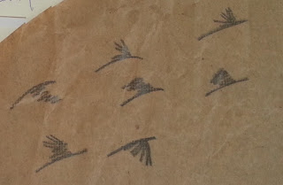
Detail of the bird drawings - they look rather stitch-like. I love them!

More from my sketchbook

The block prints made from foam with the results.

Detail of the block prints

The results from my sketchbook.

Even if we didn't have that long to make work in class I thought block printing was great fun. I loved the painterly effect - I simply painted the ink on instead of pressing the ink from a plate - and essentially block printing gives you freedom to mark anywhere on your background. You can choose to be regular or random. There's something pleasingly quirky about it. I'm definitely going to be doing more of this. I may even dig out my lino.

Can anyone recommend artists who work with block printing that I ought to know about?

==========
This post is part of a series: see Part I -- this is Part II -- see Part III
==========

Saturday, 6 June 2015

A Fun and Productive Visual Exercise


The goal is to "explore value, colour and textural arrangements within a composition, using a random selection of elements within a structured collage format."

This is how it works:

Step 1: make a selection of  same sized coloured or patterned paper - I've used these Japanese papers I had but in the end there was probably too much white on them; best to use something where the colour goes right across. Ideally, also, use more than 4 as you'll have more mixing choice later.

Step 2: cut a shape out from the whole stack - I've used a template. 

Step 3: exchange the cut out shapes - I wanted to do this randomly but found I couldn't!

Step 4: tape everything together.

Step 5: now cut a line - straight or curved - right across the whole stack.

Step 6: join the halves up randomly

Keep going cutting shapes and lines from the stack until you want to stop.

I ended up with this which actually joined two of the 'pieces' together as one.

There are of course lots of variations and the exercise goes on to explore what you can do with the pieces you end up with.

Here are some more:

Each one of these is A6 sized. 

This is something I tried in Paint out of curiosity - the line is a little wobbly but it captures the gist.

Some of these came out well. The bottom two were the ones I liked least as they were progressing but there's something 30s-ish about them that I don't mind now. Persevere!

Now that I look at the one above having made a montage of thumbnails I am really liking the way the top three rows work together at that scale. And I especially like the second row right hand piece.

I didn't like the end result of this one at all but it ended up in my sketchbook and then I started to doodle with some pastels around it and ended up with all this.

As an aside, I have been to see the Sonia Delaunay exhibition (read a Guardian review) and it has definitely influenced an interest in repeating pattern along the lines of wallpaper (above and below).

This colour scheme is inspired by some wallpaper I saw at work - this photo doesn't do it justice - which had a mix of colours I would never have put together: vibrant electric blue with red and terracotta.

I got a lot out of doing this exercise just in terms of using one of the pieces to suggest something different. But I'm sure there's lots more potential to unlock, just that I'm not able to see how to yet.

But I will learn.

Do you have any exercises you do that get you going?